Cukipedia - Food Educational website
The primary goal of the project was to create a digital experience that made food sustainability more comprehensible and accessible to a broad and diverse audience. Targeting eco-conscious users, Cukipedia aims to provide reliable information in an intuitive and enjoyable format.
Category
Website
Skills
UX Design
Art Direction
Interactive prototyping
User Research & testing
My role
Lead Digital Product Designer
Timeline
2 months
My role & resposabilities
For the main Cuki project, I collaborated with a team of two Digital Product Designers (including myself), a copywriter, and an art director. However, I managed the entire UX/UI process and artistic direction for Cukipedia independently.
My role & resposabilities
For the main Cuki project, I collaborated with a team of two Digital Product Designers (including myself), a copywriter, and an art director. However, I managed the entire UX/UI process and artistic direction for Cukipedia independently.
The Challenge
During the initial research, we found that many users had difficulty navigating fragmented and overly technical content. This led to a loss of interest and prevented them from exploring key sustainability topics.


Design Process
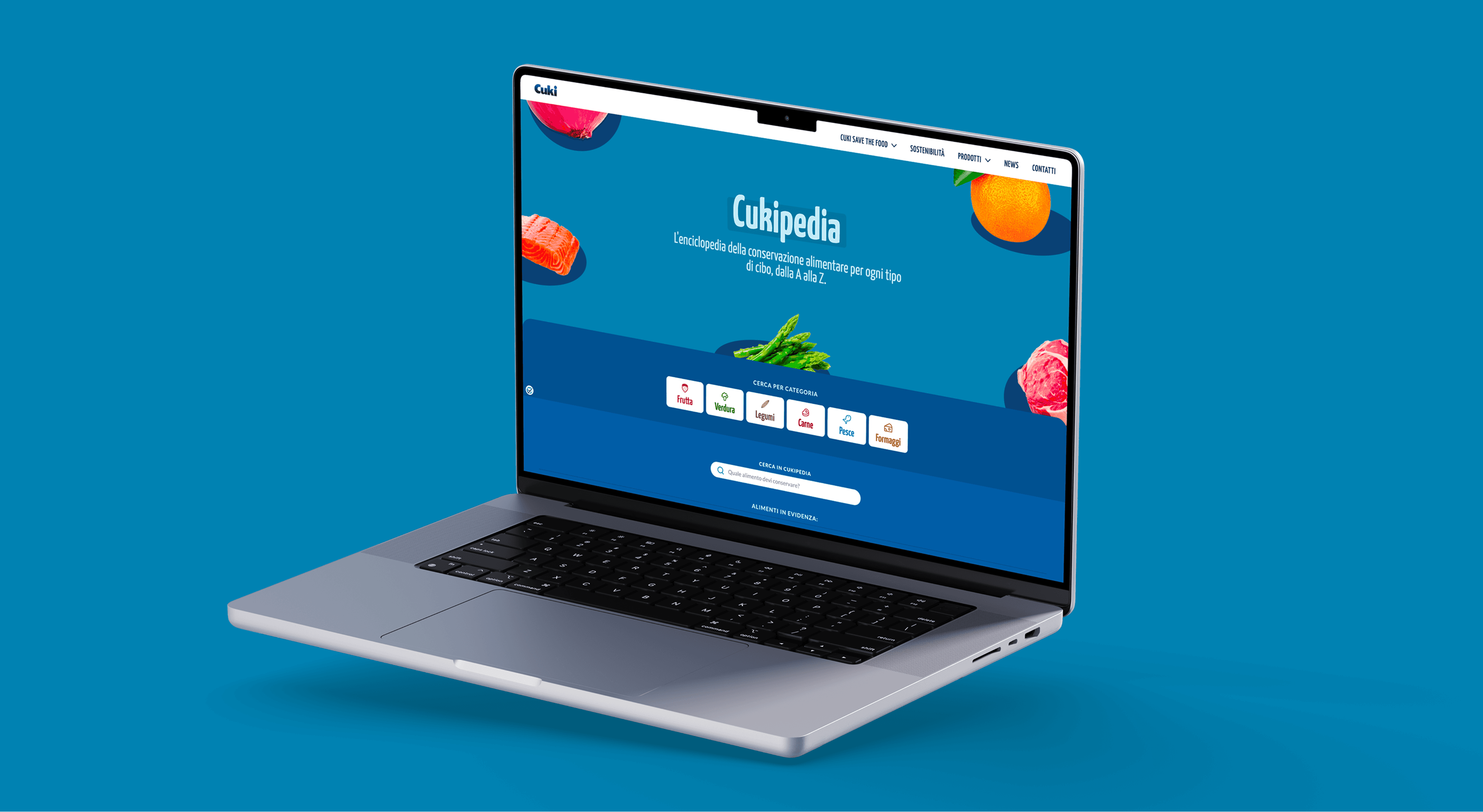
I created low-fidelity mobile wireframes to define the structure and test navigation, then developed high-fidelity prototypes emphasizing one-handed usability and quick access to key features. To improve navigation, I designed a new hierarchical structure, separating food categories into six distinct and easily recognizable sections. This allowed users to quickly find relevant information and access educational content on food origins, fun facts, and proper storage methods before moving into the wireframing phase.
I created low-fidelity mobile wireframes to define the structure and test navigation, then developed high-fidelity prototypes emphasizing one-handed usability and quick access to key features. To improve navigation, I designed a new hierarchical structure, separating food categories into six distinct and easily recognizable sections. This allowed users to quickly find relevant information and access educational content on food origins, fun facts, and proper storage methods before moving into the wireframing phase.
Design Process


Accessibility & Visual Design
The entire project was developed with a strong focus on inclusivity and visual effectiveness, ensuring readability and accessibility for all users:
- Each food category was assigned a distinctive color, carefully tested using a contrast checker plugin to meet WCAG AA readability standards.
- Clear and intuitive icons were designed to help users navigate effortlessly and improve information recognition.
- High-quality photographs were incorporated to enhance content appeal and create a more immersive experience


Seasonal Food Education & Behavioral Impact
One of the key innovations was the integration of an educational section on food seasonality, raising awareness about the importance of consuming seasonal products to reduce environmental impact.
This feature is not just informative but encourages behavioral change, promoting more sustainable food choices.
The section was designed for quick and intuitive navigation, allowing users to access relevant seasonal food information effortlessly.
Solution & Impact
The navigation experience has become smoother, allowing users to quickly access all the necessary information without friction. The newly integrated educational section not only highlights the seasonality of food but also updates in real time to reflect seasonal products, encouraging sustainable habits and reducing food waste.
Additionally, the revamped visual identity aligns perfectly with Cuki’s brand, offering a modern and engaging interface that enhances usability and creates a deeper connection with users. This transformation has led to a more immersive and practical experience, effectively bridging the gap between education and action, empowering users to make better and more sustainable food choices.
During the initial research, we found that many users had difficulty navigating fragmented and overly technical content. This led to a loss of interest and prevented them from exploring key sustainability topics.
The Challenge
The entire project was developed with a strong focus on inclusivity and visual effectiveness, ensuring readability and accessibility for all users:
- Each food category was assigned a distinctive color, carefully tested using a contrast checker plugin to meet WCAG AA readability standards.
- Clear and intuitive icons were designed to help users navigate effortlessly and improve information recognition.
- High-quality photographs were incorporated to enhance content appeal and create a more immersive experience
Accessibility & Visual Design
One of the key innovations was the integration of an educational section on food seasonality, raising awareness about the importance of consuming seasonal products to reduce environmental impact.
This feature is not just informative but encourages behavioral change, promoting more sustainable food choices.
The section was designed for quick and intuitive navigation, allowing users to access relevant seasonal food information effortlessly.
Seasonal Food Education & Behavioral Impact
The navigation experience has become smoother, allowing users to quickly access all the necessary information without friction. The newly integrated educational section not only highlights the seasonality of food but also updates in real time to reflect seasonal products, encouraging sustainable habits and reducing food waste.
Additionally, the revamped visual identity aligns perfectly with Cuki’s brand, offering a modern and engaging interface that enhances usability and creates a deeper connection with users. This transformation has led to a more immersive and practical experience, effectively bridging the gap between education and action, empowering users to make better and more sustainable food choices.


