Tankoa – Digital Control & Safety for Onboard Operations

Cover of a computer monitor displays a dashboard interface for TANKOA, showing document status, visitor management, and company compliance details.

A secure and scalable platform that manages internal and guest access, tracks onboard presence in real time, and supports safety protocols during emergencies.

Category

SaaS Platform

Skills

UX Flows & IA

UI system e components

Interactive prototyping

Documentation for technical team

My role

UX/UI Designer & Product Owership

Timeline

4 months

My role & resposabilities

I led the UX/UI design and strategic setup of the Tankoa platform. From stakeholder interviews to interface design, I defined the product’s logic, flows and interaction model.
- Designed all screens from scratch
- Built the design system
- Defined user flows and role-based permissions
- Collaborated with devs for handoff and QA

The Challenge

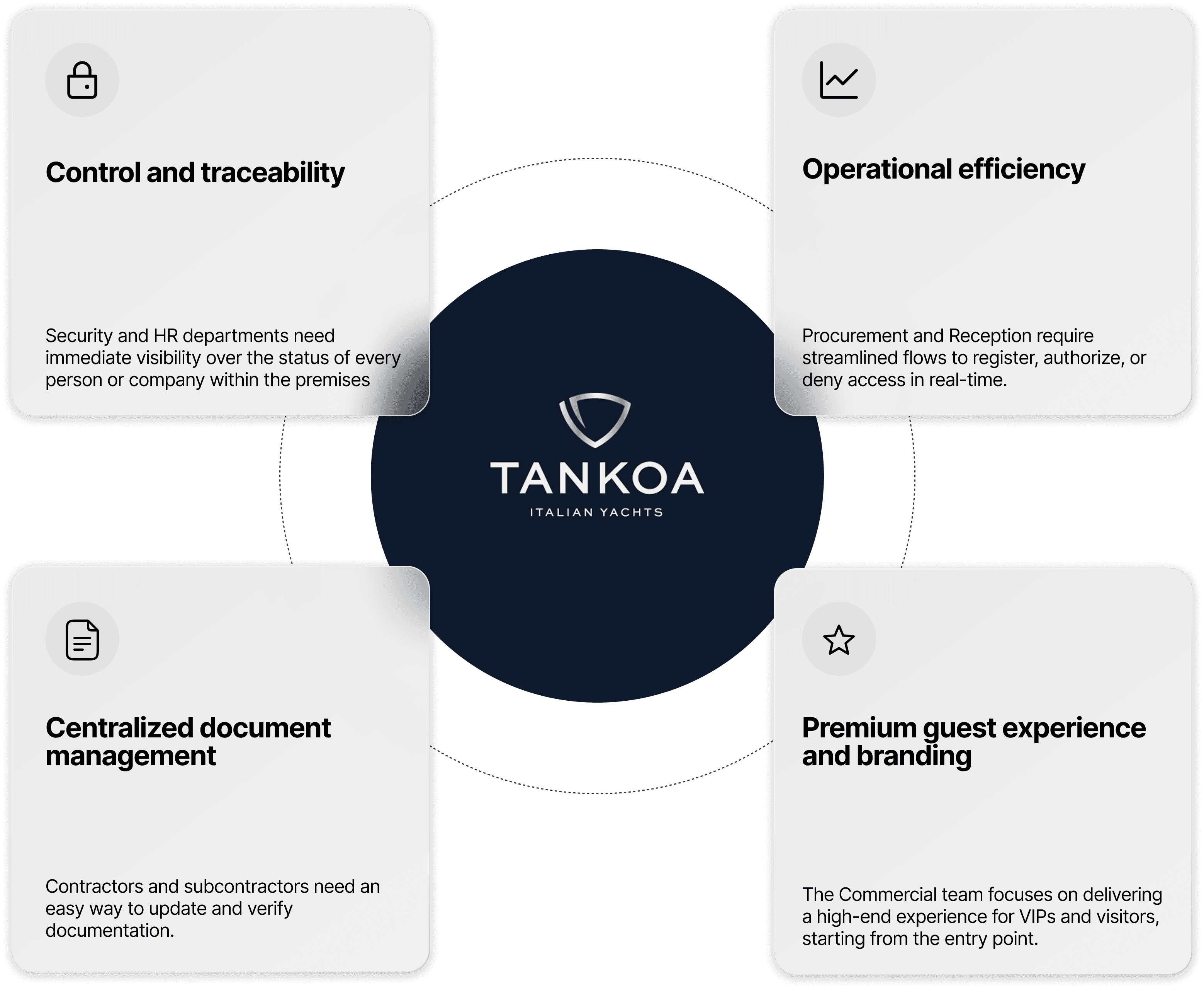
Tankoa needed a digital solution to streamline access and monitor who’s onboard at any time. Until now, everything was handled manually – from Excel sheets to physical badges – with no live visibility or integrated system for emergencies or onboarding guests.

Pain Points:
- No centralized access tracking
- Inefficient onboarding for crew and guests
- Security risks in emergency situations

The Challenge

UX Strategy

The platform serves different types of users, each with unique needs and permissions. Designing for both internal teams and external visitors required a modular and intuitive experience.

Primary personas:
- Internal staff
- HR / Security
- Crew / VIP guests

UX Strategy

Flowchart illustrating the information architecture for various roles in a company, detailing dashboards and management categories.

User Insights

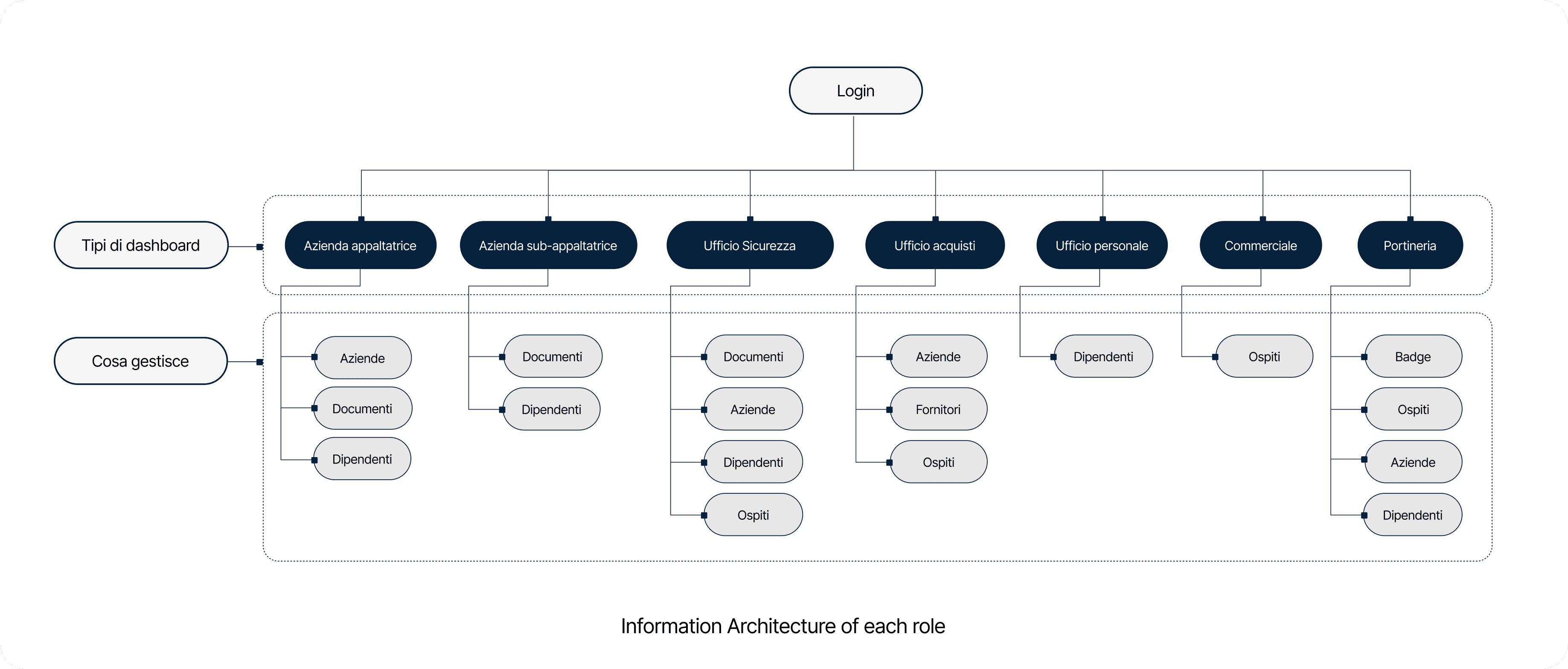
During the research and design phase, clear needs emerged from the users involved. The operational complexity of access and security management in a highly regulated context like the nautical sector revealed the need for intuitive, role-specific dashboards. Each user profile highlighted specific demands:

User Insights

Informational graphic by Tankoa Yachts outlining key operational focuses: control, efficiency, document management, and guest experience.

The Tankoa platform is designed to adapt to different operational needs, offering specific tools and real-time alerts to maintain order, safety, and control.

Visual System

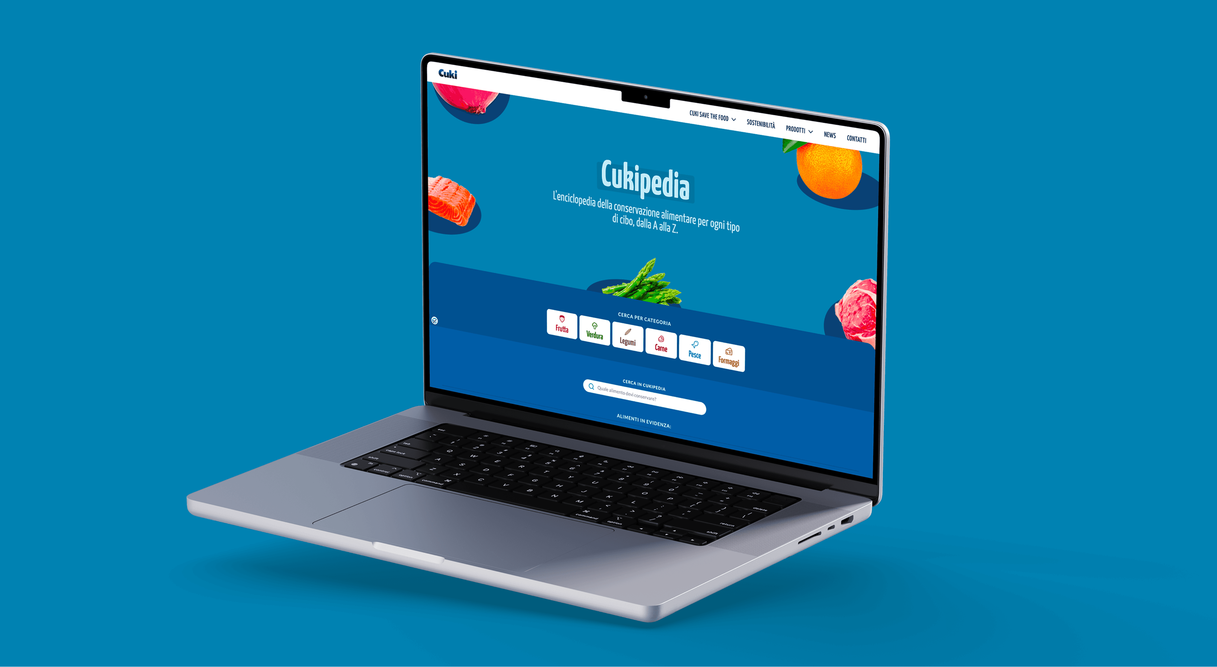
A clean and responsive design system tailored to the brand’s elegance and functional needs. Neutral tones, strong contrasts, and scalable UI components.

Visual System

Visual Identity of User interface featuring sections for status updates, employee alerts, document uploads, and password management in a modern design.

Impact & Results

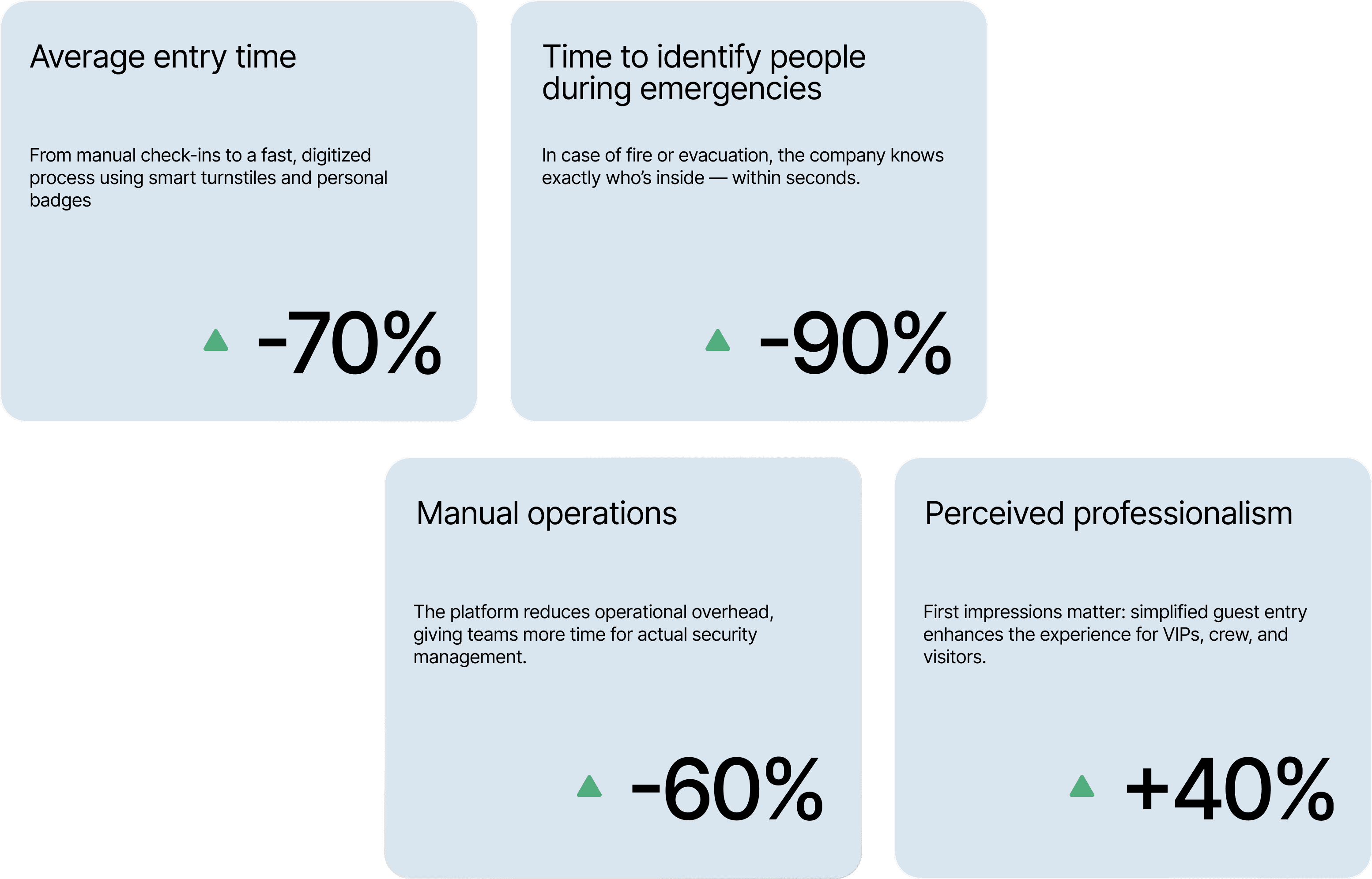
A system that improves both experience and safety, every day.

Impact & Results

Infographic showcasing efficiency metrics: reduced entry time (-70%), faster emergency identification (-90%), operational overhead decrease (-60%), and increased professionalism (+40%).

Solution & Impact

This project reinforced the power of UX thinking in complex operational systems. I focused on designing for scalability, simplicity, and multi-role access — key to evolving into a broader company-wide management tool.

Solution & Impact

Designed by Anna Bigaran

©2025

Designed by Anna Bigaran

©2025

Designed by Anna Bigaran

©2025